CLICK HERE FOR FREE BLOGGER TEMPLATES, LINK BUTTONS AND MORE! »

Wednesday, May 25, 2011

First day of Kindergarten, part 2


First Day of Kindergarten at our Local Elementary School
2008

Using another set of Kindergarten background papers, I was able to quickly complete this layout.  The pages were reversible, so I used on of each side so it wouldn't be sooooo busy!  

On the left hand page I double matted my central (and favorite!) photo of my daughter in white and blue.  I then used a coordinating red to mat the Quick Quotes quote and the Errol Hassel sticker.  (This is the school my daughter attended for Kindergarten.)

I punched a hole in the top of the vellum Quick Quote and the red mat and then I strung green and yellow fibers through the top.  By using the hole punch, I was able to anchor my vellum Quick Quote to the mat without adhesive showing!  The yellow and green fibers added a "bookmark" feel to it and make it really playful.  (I love the sweet sentiment in this poem and knew it would be perfect for this page!)
The right hand page was lots of fun too!  I matted the photos in coordinating colors of blue, green and red.    I used up a silver metal frame with an A+ on it and a small metal tag featuring an apple.  I adhered both with pop dots.  I added matching green and yellow fibers to the metal tag.  I was careful about the placement of the photos so the collage paper of the background showed through nicely.  The "Kindergarten" in the lower right and the "playtime" on the left are both part of the background paper and not added separately.  

Tuesday, May 24, 2011

First day of Kindergarten


"Maddie" Kindergarten 2008

I bought this Kindergarten themed background paper at my LSS and knew it was perfect for these photos of my daughter at her first day of Kindergarten at Learning Tree.  Yes, my daughter went to 2 kindergarten's this year because my local school district only offered half-day kindergarten and I wanted her to be in school full-time.  So, she went to Learning Tree's private morning Kindergarten and then went to the local elementary school in the afternoon for even more kindergarten!

I matted the photos in a coordinating orange and then used left over Handwriting stickers to spell "Maddie" and "2008."  (It finished up that last few stickers that I had!)  Then I used old, really old!, plastic accents that came out of a button pack.  I used a pair of wire cutters to clip off the loop on the back and to make them lay flat on the page.  The accents added a little dimensional pop to the page and pulled it altogether!

Monday, May 23, 2011

2nd Grade

"2nd Grade"
Fall 2008
I love this bright 2nd grade paper that I purchased at my LSS.  The added bonus is that my son's favorite color is orange, so it fits him perfectly!  I matted the vertical picture on a white mat and then tore a jagged edge along the bottom, leaving a wider margin for journaling and interest.  I then matted two 4x6 horizontal pictures together to make a large block.  I used large scratched silver brads to mimic the coins in the title and to ground the photos.

Sunday, May 22, 2011

Friends by Choice

"Friends By Choice"
Fall 2008
I love these photos of my kids reading together in bed one early fall evening.  (Love the farmer tans!)  The vintage background papers came in a pack from Costco and don't have a name on them.  (The pack included a 12x12 over the shoulder bag with lots of pockets, a paper pack, ribbon, lace, pens, embellishments, etc.  all for something like $29.99! Got to love Costco for those deals!)  I matted the photos in a soft green and used a coordinating alphabet to write "Friends by Choice."

I then used a Quote pack of vintage stickers that were raised and epoxied. These stickers had the same "worn" look and colors as the paper and expressed sentiments that I want my kids to grow up remembering. I added a few sprinkled around the page for a little more interest. I also matted the stickers so that I could move them around and find the perfect spot for them before I stuck them down.

I always want my children to be "friends by choice" even though they are siblings by birth.  I am truly blessed to have two wonderful children who enjoy each other's company; most of the time! ;)

Saturday, May 21, 2011

More Pumpkin Patch Fun


Yes, I am still scrapping photos from 2008, but the good news is, I am almost done! :)  Here are a few more pictures of the fun we had at the pumpkin patch that year!  The background paper is Fall Leaves and it is from an old paper pack.

I matted all the photos in black so they wouldn't get lost in the background.  I then fussy cut "Boo" from the Halloween cardstock letters.  But, if you read my earlier posts, you know that this alphabet had only one of each letter.  I needed two O's, so I took the Q (which was the cauldron) and colored off the little "stem" of the Q in black to make it into an O.  I then colored the entire cauldron so it would match and now you can't even tell it used to be a Q!  


I also fussy cut "Fun" from the same letters.  For a finishing touch, I added little silver ghost brads all over the layout just for a touch of whimsy!

Friday, May 20, 2011

Pumpkin Patch


Halloween Delight at the Pumpkin Patch
Why Halloween Delight?  Because it was the only thing I could spell with these super cute cardstock letters I bought eons ago! When I bought them I didn't notice that there is only one of every letter!  (Try spelling things with only one of every vowel!)  So Austin and I got creative and brainstormed as many things as we could think of and "Delight" was the best we could come up with!

The striped background cardstock is from an old paper pack, maker unknown.  I matted all the photos in purple and bright green to match the stripes in the paper pack and keep the photos from getting lost.
The word "Halloween" was fussy cut from the Halloween cardstock letters and then matted on purple.
I created a "film strip" of photos along the bottom to ground the layout.
On the right side page I fussy cut "Delight" out of the Halloween letters and then matted them on corresponding bright green cardstock.  I decided to keep a rectangular title block so that it didn't get too busy!


Thursday, May 19, 2011

Thankful Thursday Design Team Post--Wall Hanging

Welcome to Thankful Thursday! Here is the current project for the Design Team and I am ultra excited!  The challenge this week was to create a wall hanging!  Here is the project that I made with my daughter Maddie.  We had a blast coordinating colors, cutting with the Cricut and chatting while we made this!
 Here's the completed June calendar in a frame.  This was a wonderful project that will sit up on the dresser in our master bedroom so we can see the major events as they come.  The neat thing is that all I am "out" at the end of the month, is the paper, the rest is reusable.  Plus, I am thinking of putting each one in a scrapbook to show the day to day life of our family at this time in our lives.
First, I had this great Dad paper that has been sitting in my stash for YEARS!  If you follow my blog, you know I am in a major "use-it-up" phase, so I based my entire design on the paper.  The paper says Dad, Daddy, Pops, Papa, etc, diagonally across it.  Unfortunately it wasn't a true 12x12 and I only had 1 sheet, so I never used it.  I decided to use it as my title block background.  I then used an orange patterned paper to go under the "calendar" portion.  I found the Dad paper to be too busy to use behind the dates.  I then cut the orange/dad paper to be 11 1/2 x 11 1/2.  I matted this on a solid blue cardstock and then on another patterned orange paper.  All the orange patterned papers are from a Me and My Big Ideas Value Paper pack.  This helped get the paper back to 12x12 size.    
Next, I used my new (Thanks Mom!) Color Box Cat Eye's (cerulean) to stamp the numbers onto the paper.  I used rubber stamps from All Night Media "Stamp Squares Swirls" to make the numbers.  This was honestly the hardest part because I couldn't see how the grid would lay over it and stamp at the same time.  Finally I made tiny hatch marks in pencil at the left edge and bottom to create a "grid" that I could follow.  Of course, I didn't think of that until I had stamped the top row, so they are slightly off.  As my daughter watched me juggle 10 number stamps, she calmly said, "Mom, just stamp all the 1's in the teens, and then go back and put the one's place in."  That worked much easier than juggling the stamps for each number!  (Great thinking Maddie!)
Then I used some old letter stickers to spell June for the title.  I inked the edges with the same blue ink pad.  I also used my gypsy to create the two other decorations for the top.  The Super Dad is a direct "steal/copy/scraplift" from the Father's Day cart that I don't  own!  I used Indie Art to make the shield and hid the layers and the lions that accompanied it.  I then used Jubilee to write Super Dad.  Whenever I "make" my own cut, I make the whole thing large, link it altogether and weld it and then resize it to the size I actually need.  This is much easier on my eyes and I get less frustrated with the tiny details.  I also cut the ribbon from Locker Talk and used a white gel pen to add little pen marks.  I removed the center and stamped the 1 using the same stamps as above.  I mounted both on white paper and fussy cut them both so they pop a little more from the heading.  
Here's a blurry picture of the blank calendar grid.  It is a clear plastic calendar grid that fits a 12x12 frame so you can put anything you want behind it and reuse it over and over again!  I found this at my local craft store.
I also bought a 12x12 piece of sheet metal to go behind the paper and calendar grid to make the entire thing magnetic.  It is really thin and not heavy at all.
Here is the order of everything getting ready to go in the frame.  The calendar overlay, then the paper, then the sheet metal and that creates a magnetic calendar that fits inside a 12x12 frame.  

Lastly, I used Felt Shapes (Harvest from Fancy Pants Design) to make little magnetic embellishments to move around the calendar as I want.  (These were a steal!  My LSS had a garage sale and the MSRP was $17.00 for 4 12x12 sheets of precut felt pieces and I purchased them for $4.00!)  I used Glue Dots to stick the felt shapes to bar magnets.  They magnetize through the plastic calendar grid, the paper and all the way to the sheet metal behind!  It also adds some cute dimension to the calendar.

We have an awesome prize this month, it's a Post-it prize pack!! Don't forget to head over to Crazy About Cricuthttp://crazyaboutcricut.blogspot.com%20and/  and enter your family project!
Also, be sure to check out the other Design Team member's project for some more inspiration!  They are a talented group of ladies!

Jenny @ crazyaboutcricut.blogspot.com
Cheryl @ cardsbycg.blogspot.com
Christel @ onescrappinsista.blogspot.com
Erika @ cricutlove1.blogspot.com
Sharon @ simplysweetbysharon.blogspot.com
Bobbi @ rockgirlcustomdesigns.blogspot.com
Angie@http://sitrestdownplay.blogspot.com
Paula @www.owlbescrappin.com
Jen   http://mccalleyhouse.blogspot.com/  (This is me!!!)


Wednesday, May 18, 2011

Halloween Family Photo (minus me!)

I was able to get this GREAT family photo at the pumpkin patch and I instantly fell in love with it and wanted to showcase it in a special way!  The background paper is from Martha Stewart's Halloween Paper Pack and the black patterned paper is from a different paper pack (I lost the cover, so I don't know whose...)  I then matted the photo in black paper as well to give it a double mat.  I left the bottom of the mat longer and applied this little metal medallion with an "M" inscribed on it.  (The M is for our last name!) Enjoy!
Tuesday, May 17, 2011

Halloween

Here is a cute and quick Halloween layout using a Martha Stewart Halloween Paper Pack.  The background paper is preprinted with BOO and glittery black cats and witches!  I just love this paper!  (Austin was Yoda and Maddie was a pink poodle!  I made both their costumes that year!)

The left page features the title "Trick Or Treat" which is a fabric embellishment.  I double matted it and then matted the photos in coordinating colors of green and orange.

The right page has the photos matted using the same colors and I added a Quick Quotes velum strip "Goblins and Ghouls."  I hate how adhesive shows through vellum, so I used large brushed silver brads to hold the vellum quote to the orange background mat.  Voila!  No adhesive showing! :)

Monday, May 16, 2011

Maddie's 5th Birthday Aloha Style


I had a blast making this cute layout for my daughter's 5th birthday, which was Hawaiian themed.  I was able to get 10 photos, plus embellishments on this two page layout!


I matted the photos in rows, making them into a pyramid shape.  I left little edges of the tropical green peeking out to define each photo and keep it from getting lost in a huge photo collage.  I placed larger pictures along the bottom, and then reduced their size and the number, in each row!  I then added a premade felt flower border to both the left and right hand side of the page.  On the left page, I also added the 3x3 photo with the silver frame.  The silver frame actually holds a piece of balsa wood (one side) and cork (other side).  The silver frame wasn't tight though, so I was able to wiggle my picture in to the frame as well.  I journaled "around" the edges of the pyramid in pink pen.

 On the right hand side I used the same silver 3x3 wood frame and slipped another picture inside.  I also used the chipboard circles to give a title to the page.  

Sunday, May 15, 2011

Let Your Heart Lead You!

I had this great picture of my daughter being totally hyper before we went on the Polar Express (See the last blog entry) and I just knew I had to do something special with it!  I found this layout in an old CK magazine and thought it was perfect.  I used a piece of lightly flecked white paper and then used my gypsy to create a large heart from Gypsy Wanderings.  I used the Gypsy font to write "Let your heart lead you" and placed it on the heart just where I wanted it.  I then used a black marker and had the Cricut "write" the outline of the letters.  Once the letters were written (they were hollow) I replaced the blade and then had the heart cut.  Next I took a silver milky pen and colored in the letters to make it look sparkly.  I used a thing green ribbon with red accents and created a quick border, tying it around silver brads at each corner.  I let the heart overlap some of the border and the placed the picture of Maddie on.  I used another silver brad to adhere a wire embellishment that says "angel."  I placed what I thought was the perfect Suzy Zoo sticker of an angel to balance the photo and heart and added some journaling.  (The Suzy Zoo sticker was perfect because Maddie's nursery when she was tiny was decorated in Suzy Zoo!)

Saturday, May 14, 2011

Back to Christmas...Layouts that is!

I've been busy with so many other crafts that I haven't had time to get any "true" scrapbooking done, ie. dwindle down the huge pile of pictures that I have.  However, I hinted a long time ago about a layout that I was doing that was taking a ton of time...DRUM ROLL PLEASE!  I finished it!  (Yes, it took forever, or way longer than I usually spend, but I think it was worth it!)
We took the kids on a Polar Express Train Ride and they LOVED it. It was completely magical from the caroling, the reading of The Polar Express, to the snow falling as we approached the North Pole and then Santa!  I wanted a very special layout to remember this magical night by.  

I used black cardstock for the background so it wouldn't compete with the photos or the border I was making on the bottom of the page.  Plus, the Polar Express was at night time, so this was perfect!  I cut the words "The Polar Express" out in green with a red shadow and I did not mat any of the photos.  I then used my gypsy and cut out snow border three times.  By cutting it three times, it actually resulted in six snow banks since the negative image could be used.  I then cut out different sized evergreen trees.  I also used every train car I owned to create the little train.  I stuck the Polar Express ticket stub behind a few trees just for an added memento.  
The train was cut in different colors and I cut the layers in black to give it more definition.  Some of the accents were too small, so I used a black zig pen to fill in where they should have gone.  I used copper and black brads for the wheels.

This photo shows it best, but I cut the evergreen trees out and then traced their edge with a White Milky pen.  I then stickled the edges in clear glitter, so it looked like they had snow on them.  I stuck the evergreen trees to the background, pop dotting a few of them to give some dimension.  I then stickled the edge of the snowbank as well, to give it the freshly snowed look.  I set one snowbank on top of another, three high and layered some with popdots as well.  This created a really nice dimensional scene.  Then I placed the train down, being sure it matched in the middle where the second and third train car would meet.

Here's an up close picture of the Stickled snowbanks and trees!  I really love the way this layout turned out!

I love comments, so let me know what you think! :)

Friday, May 6, 2011

Cake Balls (Pops)

I know, I know, this is a scrapbooking blog!  BUT everyone once in a while, I get carried away and try something new for a party.  Austin's birthday is coming and I thought these cake pops (or balls) would be cute as mini "bombs" for the boys.  I decided to do a dry run and see how they would turn out.  I searched the internet for recipes and came up with a simple one:
  • 1 box cake mix, any flavor
  • 1 can frosting, any flavor
  • chocolate to melt
  • sprinkles or decorations if wanted
  • lollipop sticks ( I couldn't find them, so I cut kabobs and used them!)

 They turned out really cute, after I figured out a way to have them dry! (NOTE TO SELF: FIGURE THIS OUT BEFORE YOU HAVE ONE IN YOUR HAND NEEDING A SPOT!) I used a pizza baking pan that had holes in it, which I balanced on top of a glass! I carefully dropped the stick of each cake pop through a hole and let them dry on the pan. This kept the top of each ball nice looking!


They tasted wonderful!  Each one tasted like a little piece of fudge and they weren't cakey at all!  While I really enjoyed them and they were simple to make, I decided they took too long to make for Austin's party.  (The recipe called for a lot of cooling and chilling and various steps!) 


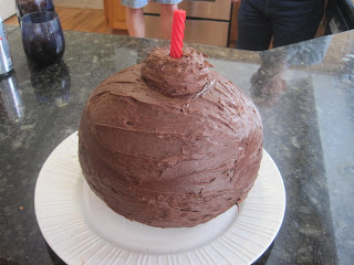
Instead, I decided to make one large "Bomb Cake!"  I baked 2 boxes of cake mix, one at a time, in a medium size pyrex glass bowl.  They took almost an hour EACH to bake because they were so thick in the middle.  I then turned the two half circles together and used frosting to stick them into a ball!  I frosted the entire outside of the cake and even added a frosting "bump" at the top.  I then used a piece of red licorice for the fuse!  The boys loved it and it was really good!

Wednesday, May 4, 2011

Little Boy Wall Hanging

While attending the CK Convention in Portland this year, I fell in love with Keller's Creations mini license plates. I have used the full sized ones for a wall hanging in our house, but as soon as I was the mini's I knew I needed a new project! I bought six of them and decided to use them to create a wall hanging for my nephew Landon's room.


I also puchased a package of cute blue and khaki patterned paper and matching buttons at Keller's Creations as well.  I used those as the jumping off point for the solid papers that came from my stash.  It was perfect because Landon's room is a nice shade of light blue!

I cut Landon's name out using Jubilee, creating a shadow and the overlay.  I inked the edges to make sure that it showed on similar colored paper.  Landon's room is decorated in robots, but I don't have a robot cartridge!  I used George (my favorite cart!) to create this cute robot.  I then slightly expanded the size of it to create a black shadow. I was inking the edges of the robot when I dropped my ink pad on the grey robot!  It was awful.  Luckily, I was able to ink over the entire robot to give it a "rusty look."  That was a quick save!  I added a few Keller's buttons with cream fiber tied through.   (Hint:  I used glue dots for the buttons and googly eyes so they wouldn't fall off!)  I inked the edges of everything in brown ink for a cohesive look!

I attached each license plate together with a blue shaded fibers.  I cut the duck from Create a Critter!  (My brother and I are HUGE Oregon Duck fans!)  A couple more googly eyes for character!  Each mini license plate has a few buttons on it to add continuity.

What little boy doesn't like milk?  I used this from Locker Talk and cut the first layer (the milk and carton) in white craft foam!!!  It made the milk look like it had real dimension.  I then popped up the center part of the red milk carton with pop dots and inked the edges of everything.  I used a White Milky Pen to write "Milk."

The dog is cut from the last few remnants of my brown fuzzy paper.  (I think it's from Every Day Paper Dolls.)  I used a brown pen to add the accents and then layered on a cute pink nose and googly eyes.  I inked the edges again!

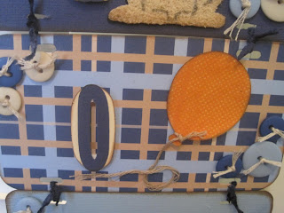
The balloon was a simple cut, but I cut off the string that was attached and tied on a real cream fiber.  I then flocked the patterned orange paper with orange flock to add a little interest.

Lastly, I added a car from Every Day Paper Dolls.  I used black brads for the tires and added a details with black paper (pop dots behind the windows!) and a black pen for details.  Lastly, I added a cute fabric tag with a curly q on it to mimic the "exhaust."

Hope you enjoy!

Tuesday, May 3, 2011

Thankful Thursday Design Team--Mother's Day Project

Welcome to Thankful Thursday! This is my first project for the Design Team, so I am ultra excited!  The challenge this week was to create a project for Mother's Day!  Here is the project that I made with my two kids. 
I bought this SEI "Mother" shape book at the CK Convention a couple of years ago, planning, of course, to do a wonderful Mother's Day project!  Well, this was the year!  The book came pre-covered in the papers you see, so all I had to do was stick the O-rings on and then add embellishments, photos and journaling!

Here's the "cover" which is the letter M.  I added fibers in matching colors to the o-rings for some added flair.  I then typed out "Grand" on the computer and then tore it to fit diagonally on the M, since this book is for the "Grandmothers!"

I added torn paper sentiments through out the book, this "I love you" is on the back of the front cover.  I asked my kids questions about each grandma and put their answers in the correct book.  (I made two identical books, one for each grandma, but with different answers from my kids!)

Some pages the photos are diagonal, because I couldn't trim them small enough.  My daughter was instant that her entire body be in this photo, so the photo is rotated! :)

Here is a page (page T) with a photo and the torn paper answer.  It says "My favorite food at Grandma's house is her blueberry waffles. ~Maddie"  Each child answered the same question, so you can compare the answers!

 Here's the "H" page and my son's quote says "I love geocaching with my grandma."  By tearing the paper, it was quick and easy to make it fit!
Since I made two books, one for each grandma, I included one picture different in each book.  My mom received a picture of me with my daughter, while my mother-in-law received a book with a photo of my husband and my son. 

Example of quotes in the book.

Too cute, right?  The kids loved picking the pictures and answering the questions!  They were able to do most of the project with me and it went really quick!

We have an awesome prize this month, it's a Post-it prize pack!! Don't forget to head over to Crazy About Cricut http://crazyaboutcricut.blogspot.com%20and/  and enter your family project!