


Sunday, February 13, 2011
It's All About the Green!
Saturday, February 12, 2011
Valentines!
This year both my children wanted to make their own Valentines, especially because the Cricut makes it so easy! My daughter is quite the artist. She told me exactly what she wanted and sat right next to my gypsy while I designed. Of course, one type of Valentine wasn't enough, so I ended up making two different kinds; one for the boys and one for the girls.


Here's the Love Bug. We used the lady bug from Create a Critter and then hid the spots. We replaced the spots with the hearts from Gypsy Wanderings. I then cut small hearts to glue over the round ends of the antennae. The shadow is black with the shell being sparkly red. The head and hearts on the antennae are both a light, sparkly pink. My daughter wrote "Be My Love Bug" on the back in gel pen. Aren't they cute?

Next, my daughter had seen a card in Family Fun Magazine that used macaroni to make little Popsicles. You dyed the macaroni and then put several across the front of the card to be a Popsicle. (Sounds like lots of work!) The phrase inside was "You melt my heart!" She loved the idea, so we used the Popsicle on Smiley cards. I made the shadow and flipped it because I loaded my Silhouette pens in the Cricut and had it write!!!!! (More writing information below!) I also cut the front and the drop from sparkly orange. Then we used the Peachy Keen Face Stamps to put on a cute grin.

I used red and pink to have it write "You melt my (heart)." Each color is a different layer on the gypsy. HINT: Put the shape you want to write on one layer. (Make sure you have flipped it if you want to write on the back.) Open a new layer and situate the text right over the shapes you can see from the other layer. Open a third layer (and so on) for each color pen you want to use. It was really simple!

My son, who is almost 10, wanted something "cool." Nothing love based or embarrassing! He asked if I had an iPod because he went surfing on the Internet and found the "iLove" on Google. (He actually searched cool boy valentine's cricut all on his own! Isn't that hysterical? He then sent me the link to my email and said, "Make this.") Well, after a conversation about manners, I came up with this. He was adamant that it not be a Valentine's day color, so we made them a "cool" blue color. I cut the shadow in black, the iPod (from My World) in sparkly blue and then the buttons and window in white. I used the same method as above to write "U Rock" on the screen with my silhouette pens.
Have a Happy Valentine's Day!
Tuesday, February 8, 2011
A Winner!
Using the Random Number Generator, it picked:
True Random Number Generator
Result:
8
Yippee for Lori! She wrote:
Very cute idea...I love it! Thanks so much for sharing and for the chance to win!
Lisa
Lisa, I'll email you with the info for your blog candy!
True Random Number Generator
Result:
8
Yippee for Lori! She wrote:
Very cute idea...I love it! Thanks so much for sharing and for the chance to win!
Lisa
Lisa, I'll email you with the info for your blog candy!
Saturday, February 5, 2011
Soccer Trading Cards in iPod boxes
Hello all and welcome to the Sports Blog Hop!

I am so glad you are here! Now you should have arrived here from Nicolette Simpson - Beyond Scrapin. If you just came by chance head over to Creations with Kathryn and read through all the exciting blog candy and start at the beginning of the hop. Below is my project! Be sure to read to the end and find out about the BLOG CANDY I am giving away!
So, our challenge today was design something sports related. Doesn't sound so tough, right? Both of my children play soccer, so I have soccer pictures coming out of my ears! I also have soccer layout after soccer layout as well, and after a while they start to run together. (Both kids have played since they were 4 years old! That is a combined 9 years of soccer pictures!) To combat my problem, I decided to create Soccer Trading Cards which fit in iPod boxes. (You can use any container you want, just alter the size of your trading cards).

First, I measured the plastic boxes and then used George and Basic shapes to create rounded corner "cards" that would fit in the boxes. (Exact measurements were 4.83 x 2.46 in.) I was able to get eight cards per piece of paper. I cut one sheet (12x12) of khaki and one sheet of bright blue. I figure each season I will change the trading card color so it will be easy to figure out what pictures are from what season. (i.e. 2007 is khaki, 2008 in yellow...)

After cutting out the cards, I began to scrap each trading card separately. Because of their small size and the desire to keep them fairly flat, this was quick and easy.

Card #1: I matted a professional wallet photo of my daughter in black cardstock. I then used Sports Mania to cut the corner soccer ball out of black and its shadow out of white. (Cut at 1.78x1.71 in.) I used a black zig marker to write the team name along the top and the year along the bottom.

Card #2: I cut a traditional 4x6 photo into a small square and matted it on black paper. I used Sports Mania again to cut the "Kick This" title frame out. I cut the title frame in blue at 2.13x1.39 in. I matted the title frame in white and adhered it to the trading card at a slight angle. The title frame has a layer for the center of the soccer ball which I cut in black.

Card #3: I trimmed another 4x6 photo to fit the card, being sure to center my daughter to the right of the card. I cut out I (heart) soccer in blue from Sports Mania at 4.83x1.00 in. I cut the heart layer out in red (.78x1.00 in.) I layered all of this to a torn strip of black paper to really make the title pop!
 Card #4: I turned this card horizontally because I couldn't get the photo trimmed to fit vertically. I matted the photo to a piece of white paper and then trimmed the mat tight on three sides. On the last side, right, I left an extra .25 inch and tore the edge. I used 3-D stickers from K & Company Peter Horjus Soccer Grand Adhesions. The three soccer balls really make this page pop!
Now that the inside trading cards are done, I have to alter the outside of the box.


The first thing I did was wrap 15" of black polka dot ribbon (3/4 in.) around the bottom edge of the box. I then wrapped 15" of black polka dot ric-rac (1/2 in) around the lid edge. I used glue dots to hold the ribbon down where the ends meet. (The ATG adhesive held the rest of it no issue!)
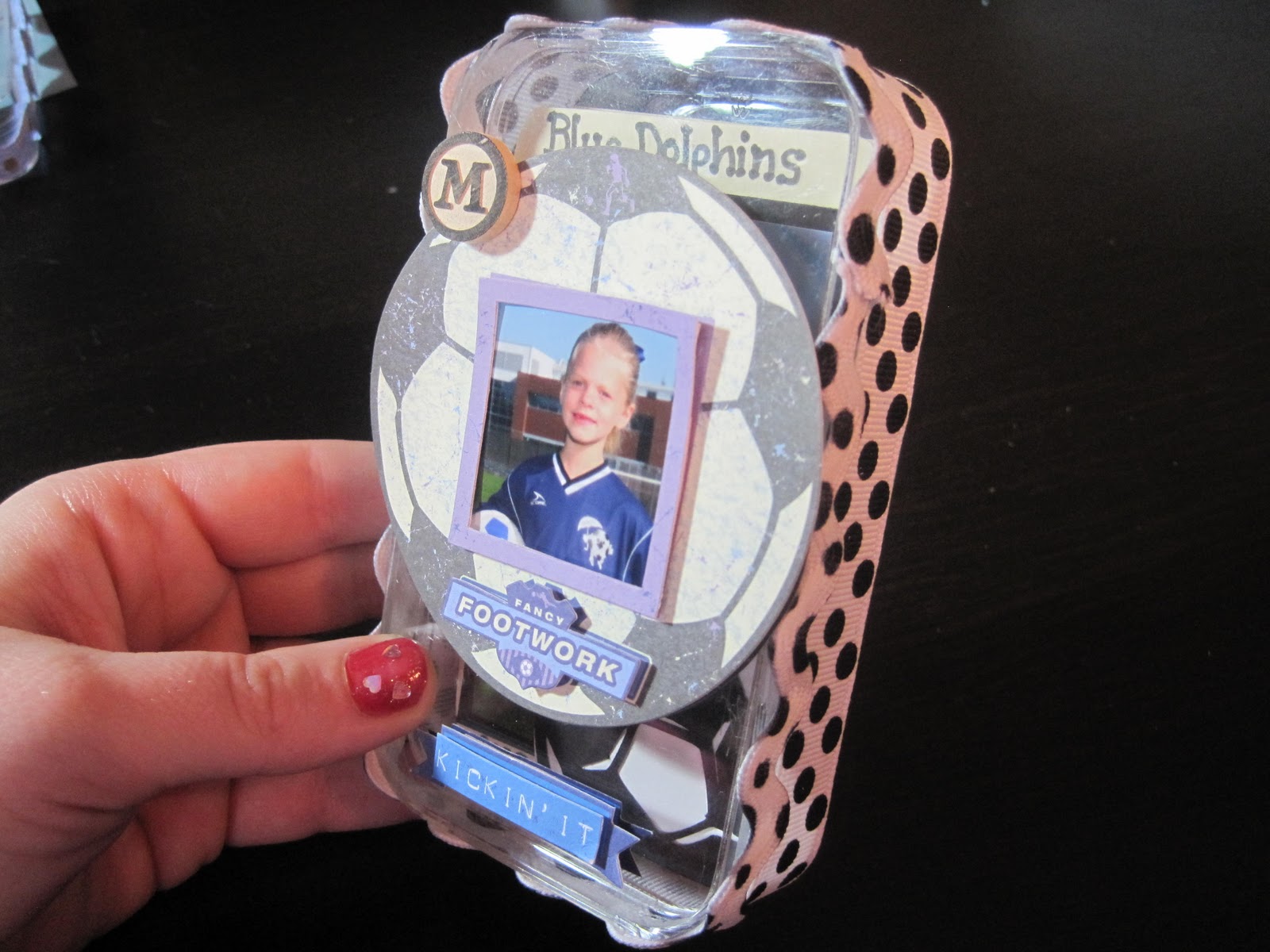
I then added two more K & Company Peter Horjus Soccer Grand Adhesions Stickers. The large soccer ball sticker is 3-D and came with the small photo frame already attached! I trimmed an extra photo of my daughter to 1" square and carefully slid it into place. I then added the "Kickin' It" sticker to the bottom center of the box. Lastly, I added a small wooden round "M" to the top left side of the soccer ball for my daughter's initial.
Of course, having two kids, I couldn't stop at one box, so I made a 2nd for my son!

This is another plastic iPod box. This time I adhered a khaki rounded corner rectangle to the top of the box and put on the #1 stickers. (Stickers from Pebbles Stickers Snpsht Wrd Stckrs Soccer.) I used a black zig marker to write my son's name.

I then put 15" of blue ric-rac with brown polka dots around the bottom edge of the box.


Card 2: I trimmed a 4x6 photo and matted it on white paper. I then used Hot Off the Press Brad Buddies (Soccer!) to put the metal, blue goal net and soccer ball onto another square of white paper. (The soccer ball is actually a brad!) I then carefully trimmed around the netting and ball to create a white shadow.


Card 4: I matted a photo with white paper and then used another Brad Buddy from the same package. The Goal is a metal plate, while the star and dot on the exclamation point are both brads. I put the brads through the metal plate and then carefully trimmed the brad flaps that you could see. I didn't want to actually send the brads through the back of the cards so I can journal on the back.

Card 5: I matted another photo on white, trimmed three sides tight, and left the bottom long. I tore across the bottom of the mat and wrote "Goalie in Training!"
I hope you enjoyed my projects; I know I did! Now, on to the blog candy! First, become a follower and then leave a comment on this project. (Open only to people in the US due to shipping rates! Sorry!) At the end of the hop I will be announcing my winner. So please check back then!! Now, you are off to
Here's the blog hop order with links for your convenience!1) wamfamily - Creations with Kathryn – http://wamfamily.blogspot.com/
2) TX Scrapper Mom - TX Scrapper Mom -http://txscrappermom.blogspot.com/
3) TinaB - Tina Time - http://ollieanddextersmommy.blogspot.com/
4) Ms Dee - Dee's Special Things - http://www.deesspecialthings.blogspot.com/
5) Lissa - So Many Crafts, So Little Time http://www.somanycrafts.wordpress.com/
6) CraftyScentiments - Crafty Scentiments –http://www.craftyscentiments.blogspot.com/
7) Scraphappybette - Believe, Dream, Create –http://www.believedreamcreate.blogspot.com/
8) bzymomof9 - Life on the Bright Side – http://quiverofangels.blogspot.com/
9) Jenne - Fairy Craft Mama – http://www.fairycraftmama.blogspot.com/
10) Nicolette Simpson - Beyond Scrapin –http://www.beyondscrapin.blogspot.com/
11) JenMcCalley - Scrappin at McCalley House – http://mccalleyhouse.blogspot.com/ You are here!!!!!!
12) VinDeeLoo - VinDeeLoo's This 'n That – http://vindeeloosthisnthat.blogspot.com/
13) roxybonds - RoxyBonds - Scrappin – http://roxybonds-scrappin.blogspot.com/
14) LisaLisa&ScrapJam - Peanuts & Pepper Paper Crafting – http://peanutsandpepperspapercrafting.com/
15) LeAnnSnyder - LuvToScrap – http://leann619oh.blogspot.com/
Wednesday, January 26, 2011
Austin and Grandpa mini album
My dad and Austin have a very special relationship. They are both nature guys, think a lot, are loyal and care deeply. These personality traits make a very unique and tight bond between grandson and grandpa. This album shows one weekend when Grandpa and Grandma took Austin to the beach.

I covered each of the chipboard pages with patterned cardstock. (Scenic Route Scrap Strip 3, Lexington Ave. and Kraft Rings). I used matching brown letter stickers to make the the simple title and then tied coordinating ribbon to the O-rings.

I matted each photo in the coordinating cardstock which was made extremely simple because each of the pages were reversible! The "Remember This" and "Good Times" ribbons are strips from patterned paper. I used a hole punch and punched the end of the strips and used the same ribbon to add a little accent. The "Me and You" on the right hand is a sticker that I matted!

While adding the felt brown flower (simple and clean lines!) I realized I was out of brads of any matching color. I found some small rhinestones in dark brown and gold to cover the opening in the middle. (Rhinestone Strass from Studio 18).

All the word stickers were made by Scenic Route Paper, which allowed them to match everything perfectly! Once again, patterned paper from the same family goes together easily, yet created a masculine, fun mini album.
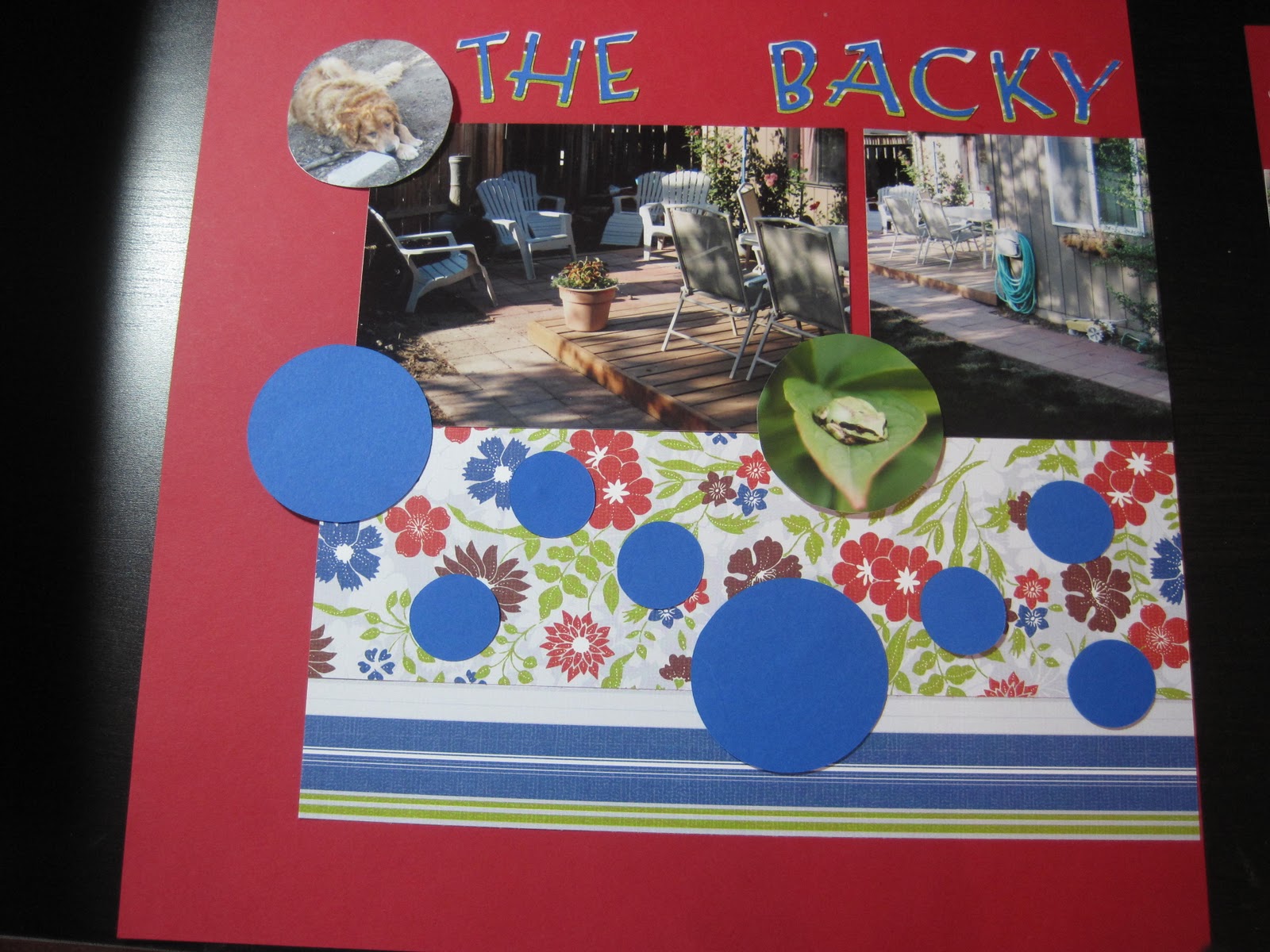
The Backyard Remodel
This is one of the layouts which looks simple, easy and clean, yet took forever! I learned a lot about the Cricut on this layout which is odd, since the page doesn't include a lot of Cricut accents. I wanted to steer clear of green backgrounds because I feel the photos would have gotten lost in them.

I used Medium Berry Red Colormates cardstock for the background and then found two matching patterned papers with the same color red accents. (The patterned paper is from PaperSalon Glad Rags floral and multi-stripe.)

Lazy Days Lots of Fun!

Lazy Days Lots of Fun!
This was created using the most recent LID sketch on the Cricut message board. I loved the layout with the large number of photos and thought this group of summer photos would be perfect. Instead of featuring one large photo on the right, I grouped 2 4x6 photos into one block! I think it balances the left page well.

Left page has two strips of coordinating ribbon across the top. I used the ribbon as the inspiration for the color choices. (I wanted bright, tropical colors for the summer photos and bright clothing.) I used a bright blue cardstock background with three strips of patterned paper. Each of the patterned papers have a coordinating color, which helps pull everything together. I matted all the photos in black to contrast with all the bright colors.

The right hand side has 2 cardstock paper strips and then a large title block. The background of the title block is the same paper as one of the patterned papers on the left side! I used black letters to continue the contrast.
Subscribe to:
Posts (Atom)


