Title page to album. 2008 is written with stickers. "Yellowstone" and the 2 borders at the bottom were cut from a Yellowstone page I found at a tiny gift shop within Yellowstone. I found a brown ribbon with green dots to cover the seam where I layered the borders on the bottom.
Bison X-ing: The only notable thing about this page is that the two bison at the bottom are cut by the Cricut (My World) using paper backed fabric. I love the fuzzy look!

 These pages are all about the geysers, steam vents and mud pots that we saw. I had tons of pictures and wasn't sure how to show case them. I decided to use the cricut to cut out a border for each page that looked like it was "bubbling" or spurting up like a geyser. I used that along the bottom of each page to connect all of these layouts together.
"Antelope, bear, elk, eaglets, and deer everywhere!" I was struggling on how to tie all of these random photos together and finally I used the cricut to cut out my very long title and interspersed it among my photos. I really like it!
 "Snow Day" While going over a pass in Yellowstone, we encountered some snow. Of course, the kids had to stop and get their pictures taken in the summer snow! I cut "Snow Day" from the Cricut!
"Here moose, moose, moose!" We looked everywhere for a moose in Yellowstone and we never saw one! I cut the title out with the Cricut and then added binoculars, a spotting scope and the scenery to the bottom to tell the story. There is hand written journaling between the top row and bottom row of photos that tells the story.
The background paper here is hard to see, but it features words that represent Yellowstone like "Yellowstone, Old Faithful, etc."
"Dinner Time" Wolves eating salmon.
"Yellowstone is Bear County" The title came from the same scrapbook page that that the original Yellowstone title came from. We went to a Grizzly Center where we could get fairly close to the bears. I matted the photos in gray to match the geysers on the background paper. (The paper has alternating rows of geysers, animals and trees.) The round bear pictures are actually buttons I purchased for the kids and then snagged when we got home! ;)
"Please
"Gone Fishing" Austin is fishing in Yellowstone. I cut out the Gone Fishin' with the Cricut from Life's a Beach, along with the little fisherman from Paperdolls. I included the fishing license for more information, like the date and where we were!
"Birds of a Feather" Maddie was feeding the birds while Austin was fishing. She actually got this scrub jay to eat out of her hand! The birds are cut from Home Accents and Life's a Beach. The title is cut from Life's a Beach font.
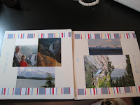
This was a really hard layout for me to do because I love these photos. These are taken at the Church of Transfiguration in the Grand Teton's. Finally I matted the pictures on the right with a patterned paper and the photo on the left with a large block for an accent. I journaled along the large block. I then just happened to have a coordinating brown and turquoise ribbon that I ran across the left page and then made a cross on the right.
"Old Faithful" I love using photos as titles. I try to take pictures of signs when we're out on vacation just so I can use them in my layouts! (If you look back at the geyser page, I did it there too!) After matting the two vertical pictures on a large blue "filmstrip" I ran a piece of blue and white fiber behind the photos and then used word stickers below the fiber. I thought adding the word stickers gave the accent more heft.


No comments:
Post a Comment